Designing a football crest that survives sublimation, silicone and a Sunday wash
Most clubs come to a kit project with a crest already in some form — a logo their founder drew in 1998, a free Canva job from last season, a Word-document copy of the original scanned in 2007. Some of those work fine on a shirt. Some of them turn into unrecognisable smudges the second they hit a chest panel. Here's how to tell which side yours is on, and what to do about it.
The file format you actually need
Three things print well on a football shirt: vector artwork (SVG, AI, EPS, PDF), high-resolution PNG with a transparent background (1500px on the long edge, minimum), and a flat colour palette (no gradients, no photographic textures, no glows).
Vector beats raster every time because we can scale it from a 25mm chest crest to a 200mm back-mark without losing edges. If you only have a JPEG with a white background — which is about 60% of the crests we see in first emails — we'll redraw it during the design rounds. Free, no extra cost, but it adds a couple of days to the timeline.
The "I have it on a t-shirt" case
A surprising number of clubs only have their crest as a printed tee or a beaten-up keyring. We can work from a clean photograph against a plain background — set the keyring on a piece of white A4 paper, take the photo from directly above in good daylight, send us the highest-res copy your phone will produce. Not ideal, but workable.
What kills a crest on a shirt
Tiny detail
A crest that reads cleanly on a website at 200×200 pixels can become an unreadable splat at 80mm wide on a shirt. If your crest contains text under 3mm tall at print size, names of stars, fixture dates, or a Latin motto in 8pt italics — it'll fail. Either remove the small detail before going to print or accept that it'll be a smudge.
Too many colours
Sublimation handles unlimited colours, so this is less of a hard limit and more of an aesthetic one. But for silicone and holographic finishes, every additional colour means another silicone layer, which means more cost and more failure points. The cleanest silicone badges we make use 2–4 colours. Your crest doesn't have to.
Drop shadows and gradients
These are the single most common reason a crest goes from "looks great in the design round" to "looks weird on the shirt". Sublimation can technically print a gradient, but on polyester at 140gsm under floodlights it tends to read as muddy. Silicone can't do gradients at all — every colour has to be a solid block.
Strip them out. A flat crest reads cleaner from a distance and ages better. Pro club crests don't have drop shadows. Yours doesn't need one either.
Thin lines
Any line under 0.75mm at print size disappears when sublimated and won't survive being moulded as silicone. If your crest has a fine engraved-looking border or hairline detailing, expect us to thicken it during the design rounds. We'll show you both versions before you sign off.
Where the crest goes on the shirt
Three placements, in order of importance:
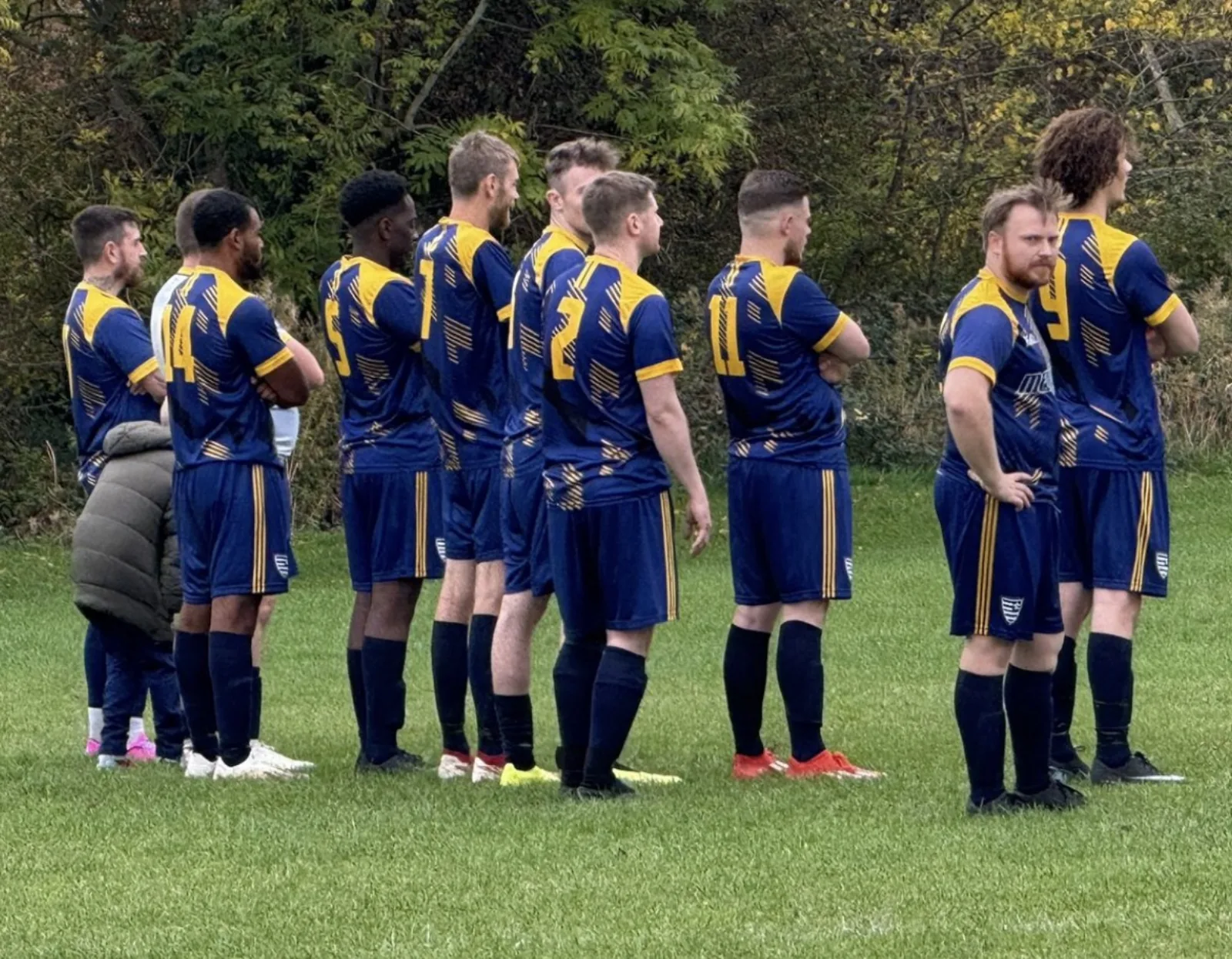
- Front-left chest — the home of the club crest on every football shirt since the invention of the football shirt. Roughly 80×80mm for an adult shirt. Non-negotiable.
- Front-centre or front-right — sponsor logo. Goes here unless your sponsor specifically asks for the chest position (very rare).
- Back of the neck (silicone and holographic packages) — Peaq mountain mark sits here. Some clubs ask us to swap this for their own back-mark — happy to oblige if you've got one.
We've been asked about full-chest crests, sleeve crests and shoulder crests. All possible. Most clubs end up at the front-left placement because it's where viewers' eyes already go.
If you don't have a crest yet
We don't run a brand-design service from scratch — we're not the right shop for that. But we know two or three independent designers who do good work for clubs at grassroots prices, and we'll happily make an introduction during the enquiry stage.
If you want to design it yourself, three rules will get you 80% of the way:
- Pick a shape (shield, circle, hexagon, badge) and stick to it.
- Pick two-to-three colours. Use one as the dominant.
- Resist the urge to put the year, the motto, and the founder's initials all in the same crest.
What we'll do during the design rounds
When you commission a Peaq kit, we send you a real-template mockup of the kit with your crest at print size on the chest. If the crest needs work, we'll either redraw it as part of the round (no extra cost for clean re-vectoring) or flag exactly what's not going to print well and recommend a fix.
We don't go to print until you sign off, and we don't cap the number of rounds — we keep iterating until the kit looks the way you want it to.
The short version
- Send us the highest-quality version of your crest you have. We'll work with what's there.
- If it's a JPEG, expect a free re-vector during the design rounds.
- Strip drop shadows and gradients before you fall in love with them.
- Two-to-four colours is the sweet spot for silicone finishes.
- Front-left chest, 80×80mm, full stop.